Turn your home into an Instagram-worthy living space without breaking the bank! Here are some truly inspiring photos and design inspiration as well as the top 2107 Bathroom and Kitchen Trends that are popping up like crazy!
TEXTURE
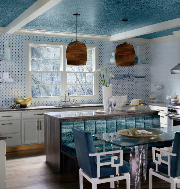
Pattern has always had a place in the home, but a willingness to mix it up and to play with scale in surprising ways is a new twist on a familiar theme. When designing this playful, blue-green kitchen, it’s the pattern play that really steals the show. In the mix is a feather-motif ceiling, a mosaic backsplash peppered with jewel-toned drops, and a quilted, blue-green banquette.
What makes it all work together? The color of the countertop, a rich, taupey-brown with copper flecks, because it is not the loudest piece in the kitchen, it brings it together in a harmonious way.
Pattern play can work in even smaller spaces like bathrooms, too. In this master bath that looks truly handcrafted, the mix is bold in scale. Large floor tiles are juxtaposed with oversized botanicals and are grounded with a calming, soft blue and cream palette on the walls.
People are, for some reason, inherently afraid of pattern and really afraid of this idea of blending pattern. But when done right, it makes for a vibrant, energetic space. At the end of the day, those who take baby steps to the big va-va-va-voom—they’re the ones who are most likely satisfied with the end result.
PERFECT PAIRS
Velvety blues and vivid greens are gaining ground in bathrooms and kitchens today. Pair them with a complementary color and that’s when the real drama happens. So what are some dynamic duos in play today? In a master bath pictured below, the color pairing of marine blue and blood orange is both of-the-moment and classic all at once. Blues are timeless. The vibe becomes infectious with the addition of blood orange—but in small doses. Highlighting traditional details of the architecture with a line, the color draws attention to the room’s tug of war between different design elements.
For another striking color play, a pairing of jewel-toned emerald and rich black brings a bit of mystery to what can sometimes be a utilitarian space. In this galley kitchen, a dark accent wall gives depth and dimension to mirroring spans of luscious emerald green cabinets, creating a luxe, moody atmosphere. It’s a bold statement indeed, but the kitchen is sometimes just where a little drama is needed.
A SOFTER WHITE
Never forget: you can’t go wrong with a white kitchen or bath. Trends come and go, but white kitchens are overwhelmingly the most popular. They feel clean and bright. Since it is typically the first place homeowners go in the morning, white makes a lot of sense.
Nevertheless, a white room can look clinical—fast—so the challenge is to keep it crisp and clean but still make it an inviting space. One way to soften the look of a white kitchen is with warm tones like brass, gold, or bronze. In this classic galley kitchen, the scheme gives it a modern edge by using countertops with subtle flecks of gold and brass fixtures instead of nickel or chrome.
Brass and bronze elements brings out those little flecks of gold and reflect a little bit of light and create a warm ambience without you really knowing it.
Another room where you start your day? The bathroom, of course! This elegant white bath is energized with a modern mix of metals—a bold brass chandelier paired with titanium bath fixtures. Warm wood floors ground the room and soften the look of the all-white space. It’s just enough “clean and bright” for a morning pick-me-up, without jolting you into the day.
KEEP IT NEUTRAL
If you’re looking for a way to introduce color but aren’t ready to go canary yellow, neutral shades work beautifully in both kitchens and baths. And today’s neutrals play in a more unusual palette than you might expect—think pale icy blue and blush sand and more refreshing straight-from-nature shades than your standard beige. They’re perfect for small rooms. Just because a space is smaller, does not mean you have to use colorless, you just have to use it wisely.
These more transparent pales diffuse light beautifully and lend themselves particularly well to elements of contrast. In this tiny house kitchen, a matte black faucet and an olive countertop pop against icy blue cabinets.
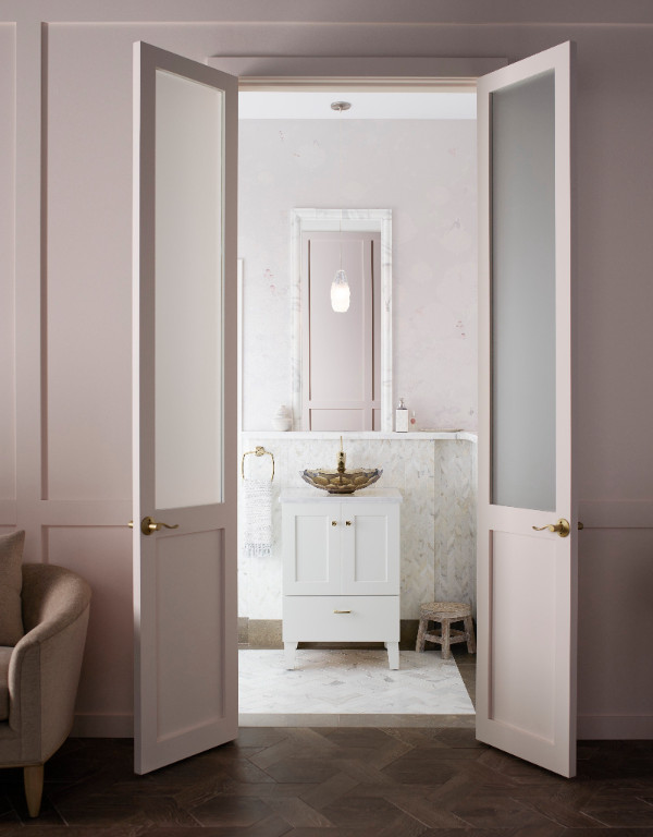
In a small powder room on Park Avenue, however, a translucent glass sink in dusky gold and a tobacco tile border make a bold statement against a pale pink backdrop. Neutral and natural don’t have to mean soft.
AMBER GLOW
Let’s face it—the living room has expanded. With comfortable banquettes in the kitchen and easy chairs in the bathroom, we are “living” in every room today, so the more alluring the better. A cozy sultry palette is just the ticket, adding rich ambers and a range of metallics to the smoky grays that have been making their way into the kitchen and bath.
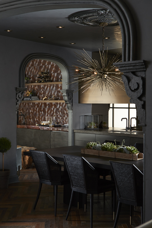
In this kitchen vignette, to feel like a space in a little flat in Paris, the kitchen is designed more as a hangout, and less of a kitchen. Antique brass upper cabinets that have natural, inherent warmth, is paired with a bronze mirror backsplash, from top to bottom, that reflects the striking Jean de Merry chandelier. The trick to this look is keeping the space from getting too dark or heavy, so a little glow goes a long way.
The main thing is the reflection, making sure that it didn’t feel bogged down by the color and the texture. And, of course, a moody atmosphere is perfect for a powder room or a master bath. Here in this Victorian-inspired bathroom, smoky grays and dusty browns are paired with a metallic wallcovering and warm bronze light fixtures, giving a glow that radiates through an already welcoming room.
NOIR
Classic black is a perennial favorite in interior design. Once a staple in bathroom design, black has made its way back into this private space and is making its presence felt in the kitchen more frequently, too, especially with the recent debut of black stainless steel appliances.
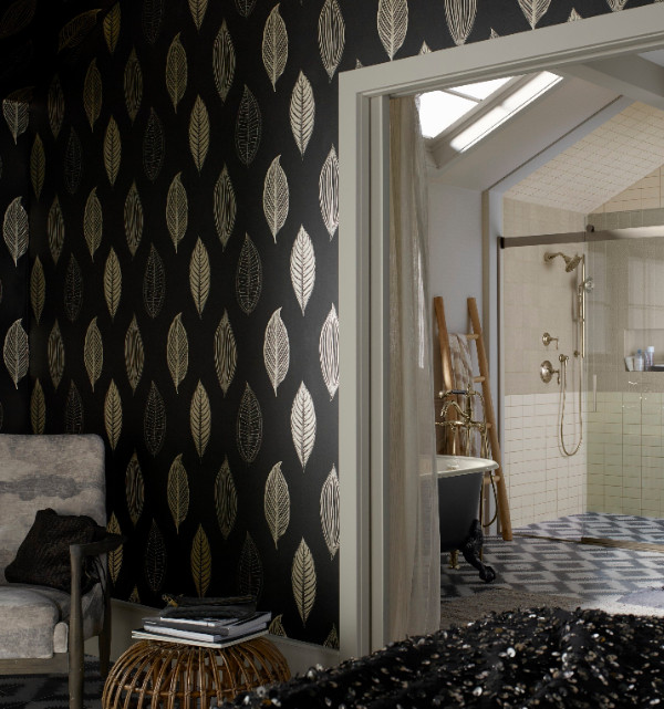
But it’s the emphatic pairing of black and white that is the real showstopper of late. Think high contrast: strong color-blocking, big heavy stripes and even more unexpected patterns. In this master bath, bold chevron floor tiles offset the glossy white tub with a matte black exterior. Highlights of bronze, brass, or copper work particularly well layered into the overall design—here bronze adds a touch of warmth to this dynamic space.
In this striking black-and-white kitchen, a wash of bright white counters cover the island and punctuate the grand room sheathed in black cabinets. If you’re an eclectic person, having your kitchen be a solid black and white is important because you may have bright colors that you want to incorporate. This space combines timeless quality with a perfect modern mix.
Kohler’s rich heritage as a bathroom and kitchen innovator boasts many industry firsts, including the world’s first cast iron bath tub; the first colored bathroom suite; ground-breaking print ads during the 1970s; and more recently the first tank-less toilet; the carbon-fiber Karbon articulated faucet, and the most advanced smart toilet, Numi. Kohler’s legacy strengthens its position as a thought leader in the home décor industry with the launch of 2017 Kitchen and Bathroom Trends.
Kohler, with over 140 years of expertise designing bathroom and kitchen products, makes realizing your dream kitchen or bathroom easier through its 2017 Kitchen and Bath Trends. Paired with the company’s new online Bathroom Design Service aimed at helping consumers create their perfect bathroom for just $399, the brand allows clients to take advantage of its décor trends and design expertise.
Taking the next step has just become easier because homeowners can now work with a Kohler designer to visualize and create a dream bathroom.
Homeowners can determine their style preferences with the help of Kohler, either visiting Kohler online or at a Kohler showroom. In creating the Kohler 2017 Kitchen and Bathroom Trends, the company discusses details: what particular colors mean, how to use them, and what’s trending right now.
Happy Designing!


